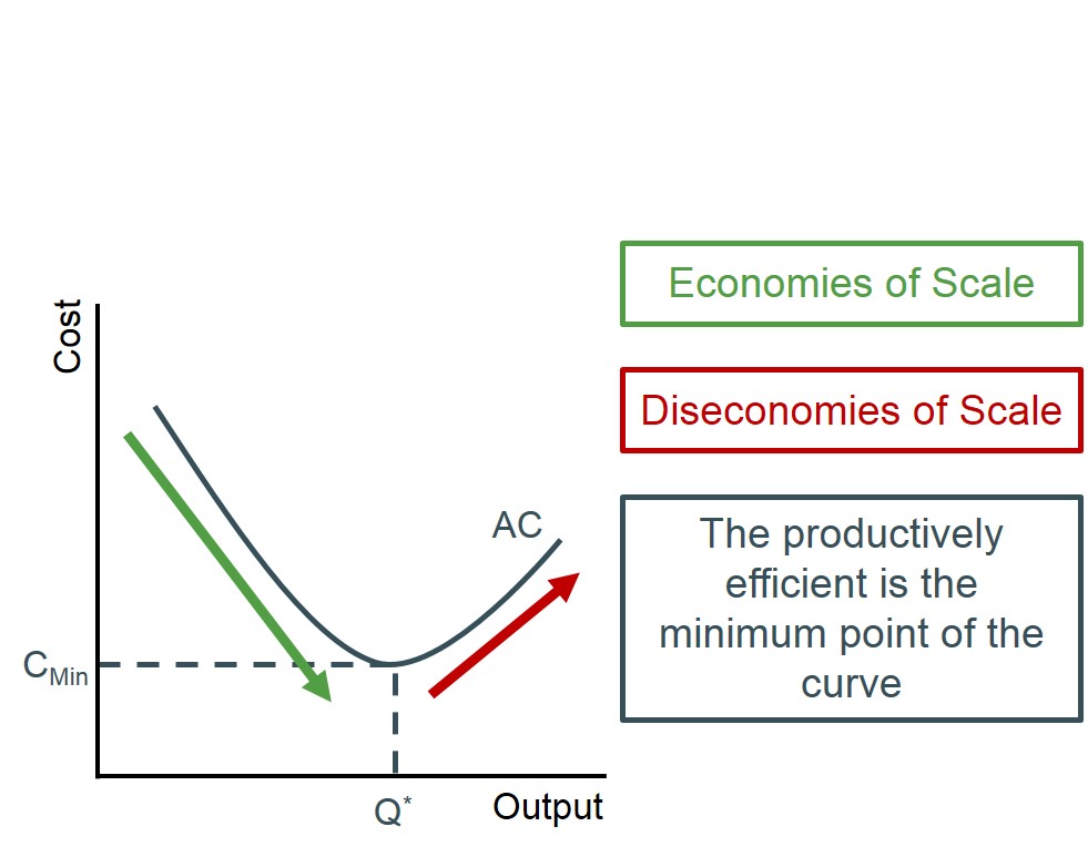
A curve drawn to connect the average costs of production at every level of output. The curve will be U shaped and the lowest point will be the Pareto efficient point. This identifies the output producing the lowest average cost (productively efficient output).
Below is a diagram to illustrate the basic shape of the average cost curve. The section of the graph in which average costs are falling is when the firm is experiencing economies of scale and the red section of the graph is when the firm is experiencing diseconomies of scale. Therefore as the graph illustrates firms should be aiming to produce at the quantity that yields the minimum of this u-shaped curve i.e. producing too much leads to excess costs, inefficiency and diseconomies of scale.